Hi everyone! It's Elisabeth, bringing you the sketch of the month and a couple great takes on it by a few of our design team members.

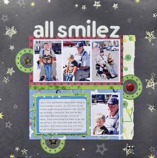
I Love what Lisa did with the sketch, she kept the same basic design, but smooshed it up into the center and added lots of "white space" around the central design, and you gotta love the letter Z in the tittle!
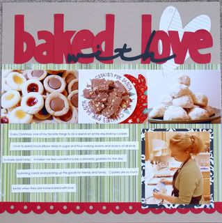
 I adore the homey feel of Jessica's layout, just perfect for the topic! OMG, don't those cookies look yummy?!!!
Look for the January newsletter to see my take on this month's sketch!


No comments:
Post a Comment