And then you get it home,
And pull it out to admire once more,
And it hits you… what on earth are you going to do with this stuff?!
I have to admit that’s how I felt at first about the beautiful Halstead 2 line from American Crafts.
 I adore the colors and the design, and I knew I had to have it to play with, but it’s so funky I wasn’t sure where to start. So today I could really gush to you about how beautiful this paper is in person (which it IS, what you see online really does not do the texture of these papers justice!), but rather I’m going to share with you three tips for working with bold papers such as these, in the hopes you’ll take that leap with me and see what you can create with them too!
Tip # 1: Downsize
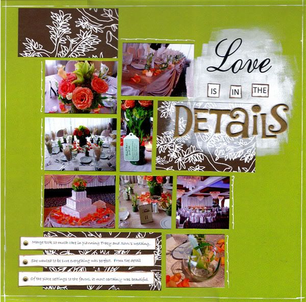
Less is more when working with bold and busy patterns. Using just a little bit can really enhance your layout and give you lots of detail. I used only a few scraps to add some touches to the layout to the right, and found I didn’t need much else.
Tip # 2: Work outside the lines
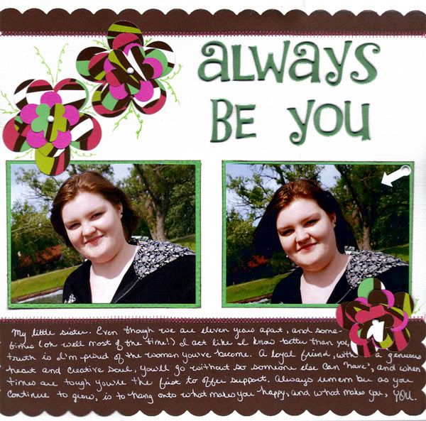
Sometimes when a pattern is so bold, you feel as though you must keep to the lines that are already “drawn” for you and get stuck trying to create around it. Not necessary! An advantage to a really bold design is that you can cut it several different ways, and end up with several different, yet coordinated, pieces. I used the boldest of this particular paper pack to create the flowers on the layout to the left – taking it from over-powering to just the right funky touch. 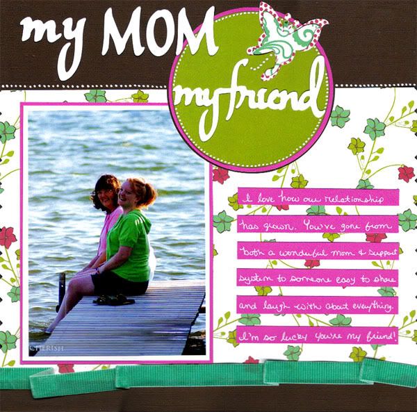
Tip # 3: Don’t be afraid to cover it up
When a pattern is so beautiful, it can be hard to design the layout around your photos rather than the paper. Keep in mind that it should be used to show off your photos, not the other way around. A good rule of thumb to make sure this is the case, is to coordinate colors in your photo(s) with one or two found on the paper you wish to use. While we mostly do that when Scrapbooking anyway, it’s extra important when the colors are so bright. Don’t have any photos that match? Convert them to black and white. I happened to get lucky with this photo of my Mom and I in pink and green.
When a pattern is so beautiful, it can be hard to design the layout around your photos rather than the paper. Keep in mind that it should be used to show off your photos, not the other way around. A good rule of thumb to make sure this is the case, is to coordinate colors in your photo(s) with one or two found on the paper you wish to use. While we mostly do that when Scrapbooking anyway, it’s extra important when the colors are so bright. Don’t have any photos that match? Convert them to black and white. I happened to get lucky with this photo of my Mom and I in pink and green.
So there you have it! I hope if you’re a little nervous about papers such as these the tips above inspire you and give you the confidence to give them a try. Once you start playing with these and get used to it, you’ll have all sorts of new and fun layouts to show off!
Have a wonderful and safe holiday weekend!
All the best,
Jess
Have a wonderful and safe holiday weekend!
All the best,
Jess


WOW you really worked those papers Jess! I was too intimidated by them to buy them but now you make me want them!
ReplyDeleteGreat job!
I have to agree with April. I, too, have been intimidated/ overwhelmed by those big prints, and you made it lok totally effortless. Beautiful job!
ReplyDeleteI'm agreeing with April & Becky. I would have been too intimidated to pick them up but you've done a fantastic job with them. Thanks for the tips. Maybe some of those papers in my stash that intimidate me will get used now. :)
ReplyDelete